


9 Report Charts Worth Sending, and the Prompt Behind Each One

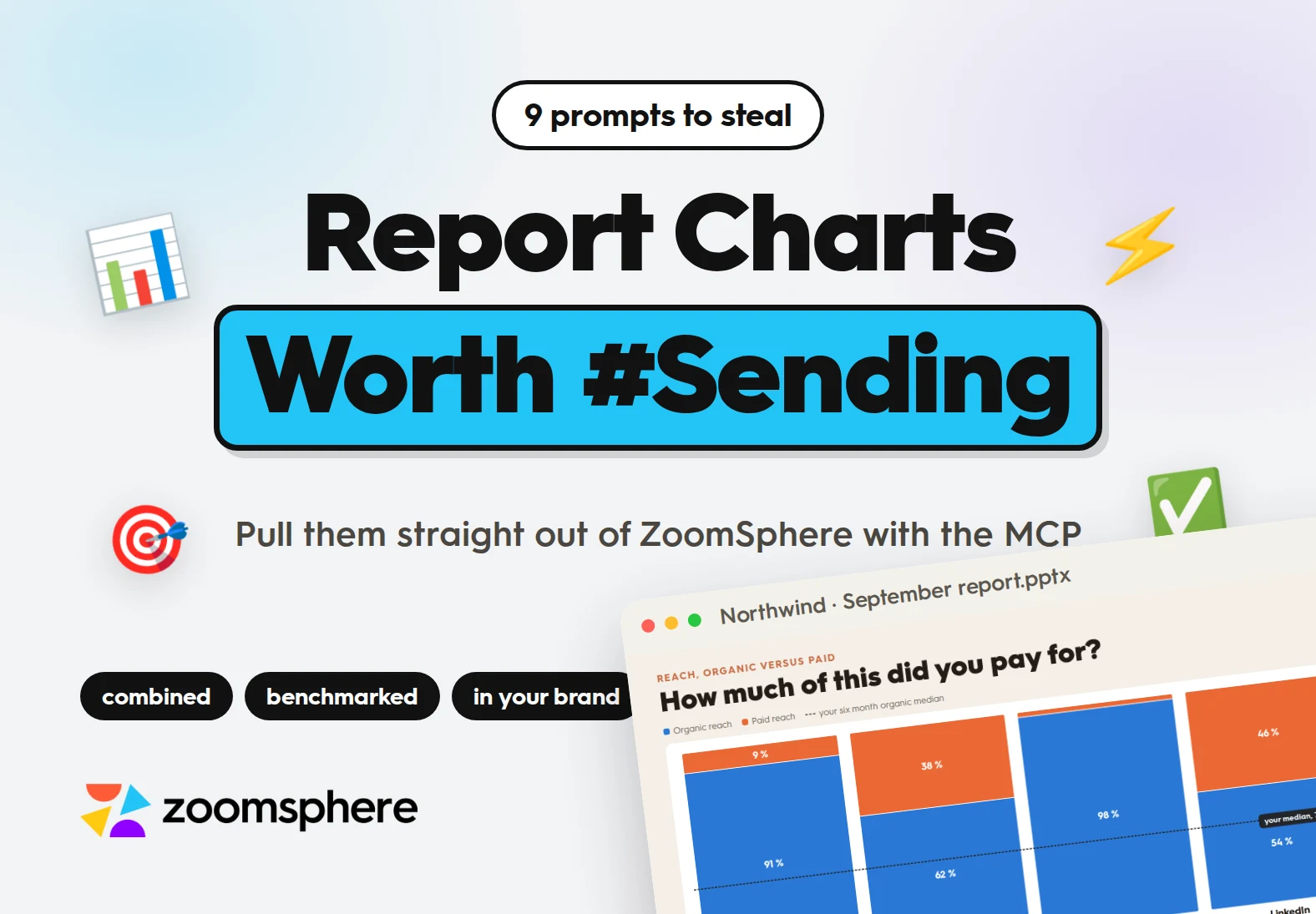
Can AI build the charts in my client report, not just the numbers? Yes, and the difference between a deck people read and a pile of bar charts is one thing: whether your prompt describes the form or only the data. Ask for saves and you get a bar chart. Ask for a scatter with saves on one axis, save rate on the other, bubbles sized by reach and a crosshair at your medians, and you get the finding. This guide has nine chart forms that earn their place in a monthly report, the slide each one produces, and the full prompt behind it, ready to copy.
{{form-component}}
Key facts
- Nine slide prompts you can paste into any MCP client, each one naming the chart form, the palette, the labelling and the benchmark, not just the metric.
- Every number is read live from your own ZoomSphere workspace through the MCP connection. No exports, no pasted spreadsheets, no screenshots of a dashboard.
- One brand block at the top of the chat keeps all nine slides looking like a single deck instead of nine documents.
- A master prompt at the end chains the whole deck into one build, ready to drop into a monthly scheduled task.
- Four rules underneath the prompts: name the form, always give it a benchmark, never use two y axes, and fix the palette for the whole deck.
The data was never the hard part. Your posts, your reach, your approvals already sit in one place, and a connected AI can read all of it in a second. The hard part is that unless you say otherwise, it will turn every one of those numbers into the same horizontal bar chart, and your client will skim to the last slide.
So this is not a list of metrics. It is nine chart forms, each chosen because it answers a question a bar chart cannot, with the exact prompt that produces it. The prompts are long on purpose. You write them once, and from the second month onward the whole thing is one sentence.
First, one brand block
Paste this once at the top of the chat, before any of the nine. It is the cheapest thing you can do to make a generated deck stop looking generated, and the paragraph about the chart palette is the one doing most of the work.
The brand block
Before you build anything, here is my brand. Apply it to every slide in this deck.FONTS: Hurme Geometric Sans No. 3. Headings in Black weight, body in Regular. Fall back to a geometric sans if Hurme is not embedded.COLOURS: headings in terracotta #C96A42 on a cream #F4EFE7 background, body text in #231C16, cards in white.LOGO: bottom left of every slide, followed by the client name in bold capitals.FOOTER: bottom right of every slide, in light grey, reading "Source: ZoomSphere MCP" followed by the exact metric names that slide used.LAYOUT: copy the deck in this folder. Match how it titles a slide, where the kicker sits above the title, and how much air it leaves around the chart.CHART PALETTE, and this is the part that usually goes wrong: one fixed set of colours for the whole deck, assigned in the same order on every slide. Blue #2a78d6, orange #eb6834, green #1baf7a, yellow #eda100, violet #4a3aa7. Red #e34948 is reserved for the thing that is wrong and is never used as an ordinary series. Grey #52514e is reserved for benchmarks, medians and targets. Do not invent a new palette on slide four because it looked nicer.Every slide gets a title written as the question a client would ask, and one sentence underneath in a white band that says what the chart means. No slide ships as a chart on its own.
01. Organic versus paid: how much of this did you pay for?
The form: 100 % stacked columns with a reference line.
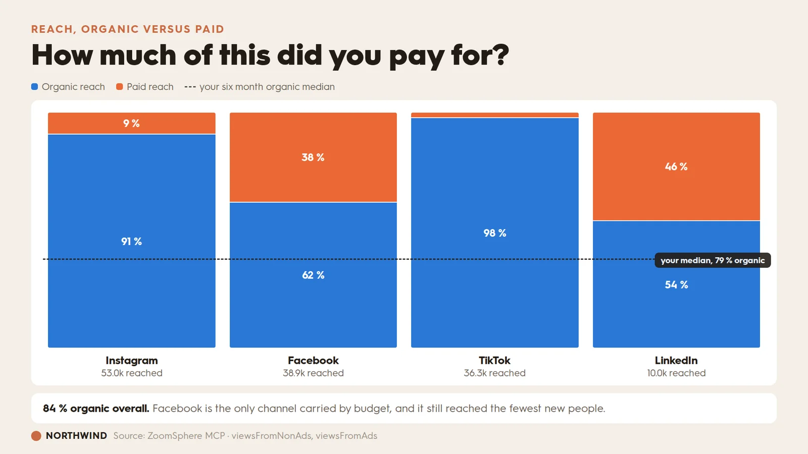
A single reach number lets the client assume the budget did it. Splitting the column and drawing your own median across all four channels turns one number into an argument. The median line is what makes it a benchmark instead of a status update.
Prompt 01
Using the ZoomSphere MCP, pull reach for 1-30 September 2026 across all connected channels, split into organic and paid (viewsFromNonAds and viewsFromAds). Pull the same split for each of the previous six months so you can work out my organic median.Build one slide:- A 100 % stacked column per channel, in this order: Instagram, Facebook, TikTok, LinkedIn.- Organic in blue, paid in orange, and those same two colours everywhere else in the deck.- Print the share inside each segment in white bold, but only where the segment is tall enough to hold it. Leave the number off rather than letting it overlap an edge.- Under each column: the channel name in bold, and the total people reached under that in light grey.- Draw one dashed dark line straight across all four columns at my six month organic median, with a small dark label at the right end reading "your median, NN % organic".- Title the slide as the question a client would ask, not as a metric name.- Under the chart, one sentence in a white band stating the overall organic share and naming the one channel that is carried by budget.If a channel had no paid spend in the period, show it as 100 % organic rather than dropping it. If a channel has no data at all, leave it out and say so in the sentence.
02. Followers versus new people: did we grow, or just talk to ourselves?
The form: butterfly chart plus a four step funnel.
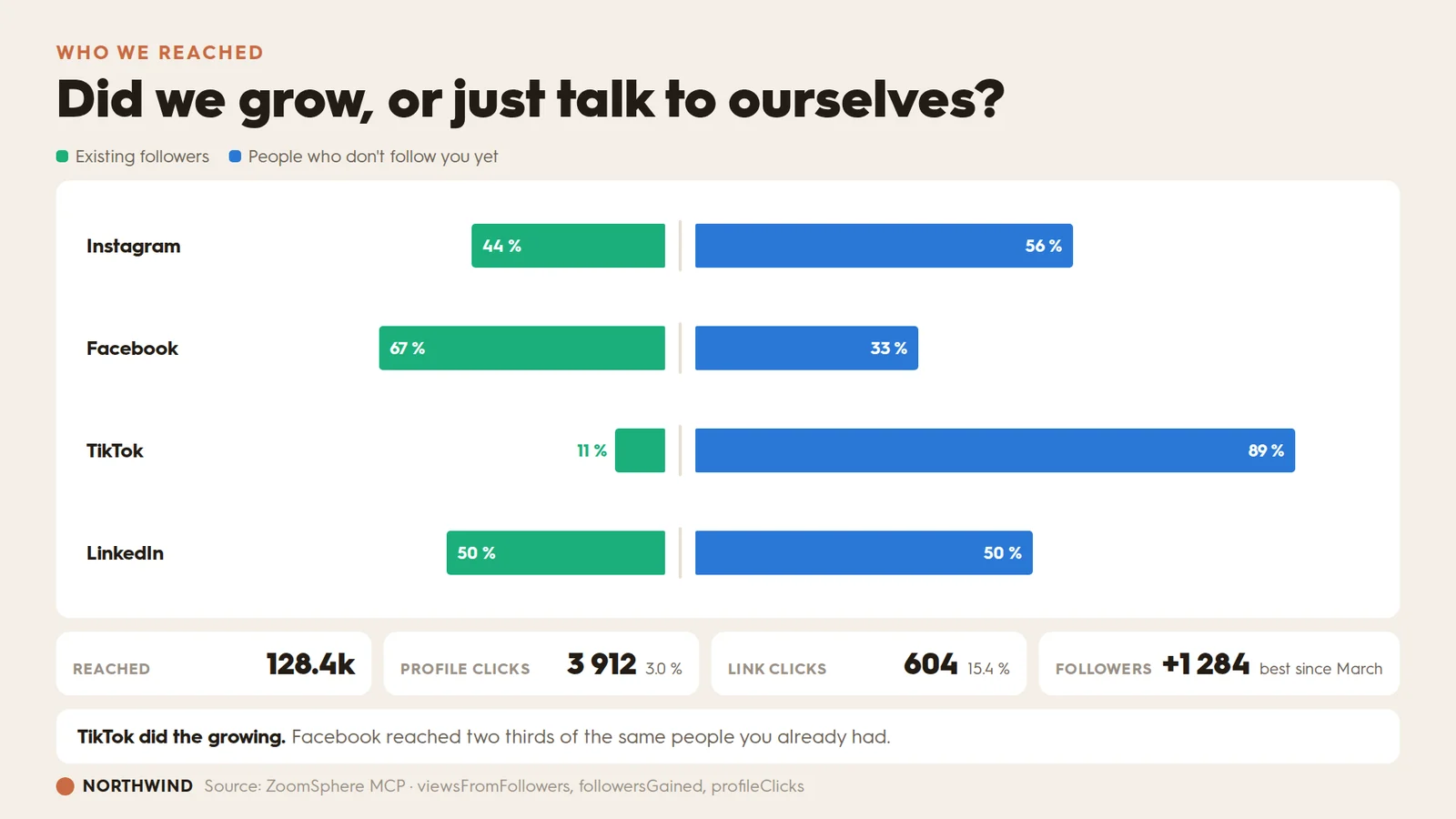
Reach hides the only question that matters for growth. A butterfly puts the two audiences back to back so the answer is one glance, and the funnel underneath turns the new audience into something the client can price.
Prompt 02
Using the ZoomSphere MCP, pull views from followers and views from non followers for 1-30 September 2026, per channel, plus followersGained, profileClicks and clickThroughRate for the same period.Build one slide:- A butterfly chart, one row per channel, channel name on the left in bold.- Existing followers grow left from a centre line in green, people who do not follow yet grow right in blue.- Put the percentage inside each bar in white. If a bar is too narrow for its label, move that label just outside the bar, in the bar's own colour, rather than shrinking the type.- Keep the centre line a thin neutral rule so the two sides still read as one chart.- Sort the rows by the non follower share, highest first, so the best channel is at the top.- Under the chart, a four step row of cards: reached, profile clicks, link clicks, new followers. Each gets the absolute number in large bold, and under it the conversion from the step before as a percentage.- Title it as a question about growth, not about reach.- One sentence under the chart naming the channel that grew and the channel that only reached people you already had.
03. Where they found you: how people found us
The form: donut with month on month deltas.
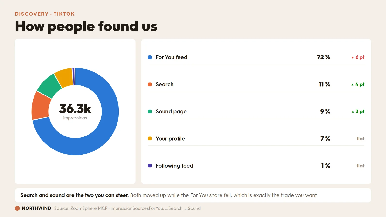
A donut on its own is decoration. A donut with a change column next to it is a decision: it tells you which discovery surface to work on, and which one is quietly shrinking while the total holds steady.
Prompt 03
Using the ZoomSphere MCP, pull TikTok impression sources for 1-30 September 2026: impressionSourcesForYou, impressionSourcesSearch, impressionSourcesSound, impressionSourcesPersonalProfile and impressionSourcesFollow. Pull the same five for 1-31 August so you can work out the change.Build one slide:- A donut on the left, one colour per source, in a fixed order so a source keeps its colour if I rebuild the slide next month. Total impressions in the middle in large bold, with the word "impressions" under it small and grey.- Leave a small gap between slices so they read as separate pieces.- On the right, a list: colour swatch, source name, the share as a percentage in bold, and the change against August in percentage points, with a green up arrow, a red down arrow, or the word "flat".- Do not put percentages on the donut itself. The list carries them.- Title it as the question "how people found us".- One sentence under it naming the two sources that moved up, and what that means for what we make next month.
{{cta-component}}
04. Retention, reel by reel: where people leave
The form: a line panel over a bar panel, with your own range shaded.
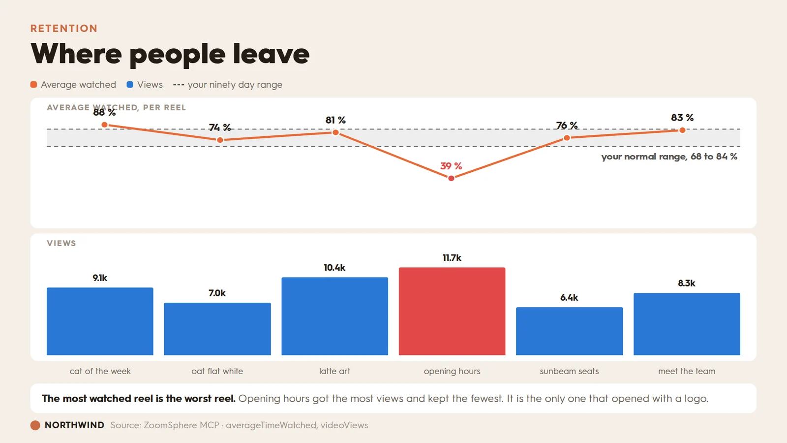
Views and watch time are different scales, so they do not belong on one chart with two axes. Stack two panels over the same reels instead, and the contradiction becomes visible: the reel with the most views is the one people abandoned.
Prompt 04
Using the ZoomSphere MCP, list every reel published to Instagram between 1 and 30 September 2026 and pull averageTimeWatched and videoViews for each. Pull the same metric across the last ninety days so you can work out my normal range, the 25th to 75th percentile of average watched.Build one slide with two panels stacked vertically, sharing the same reels in the same order left to right:- Top panel: a line of average watched per reel in orange, a dot on every reel, and the value printed above each dot. Shade my 25th to 75th percentile range as a grey band across the whole panel, labelled "your normal range, NN to NN %" at the right end.- Bottom panel: bars of views per reel in blue, with the view count above each bar.- Colour the worst reel red in both panels, the dot and the bar.- One shared row of captions under the bottom panel, one short caption per reel.- Never put both measures on one chart with two y axes. Two panels, two scales, one set of categories.- Title it as the question "where people leave".- One sentence under it naming the reel with the highest views and the lowest retention, and what that reel had that the others did not.
05. Sentiment, for free: how they felt, not just how many
The form: waffle, one square per cent.
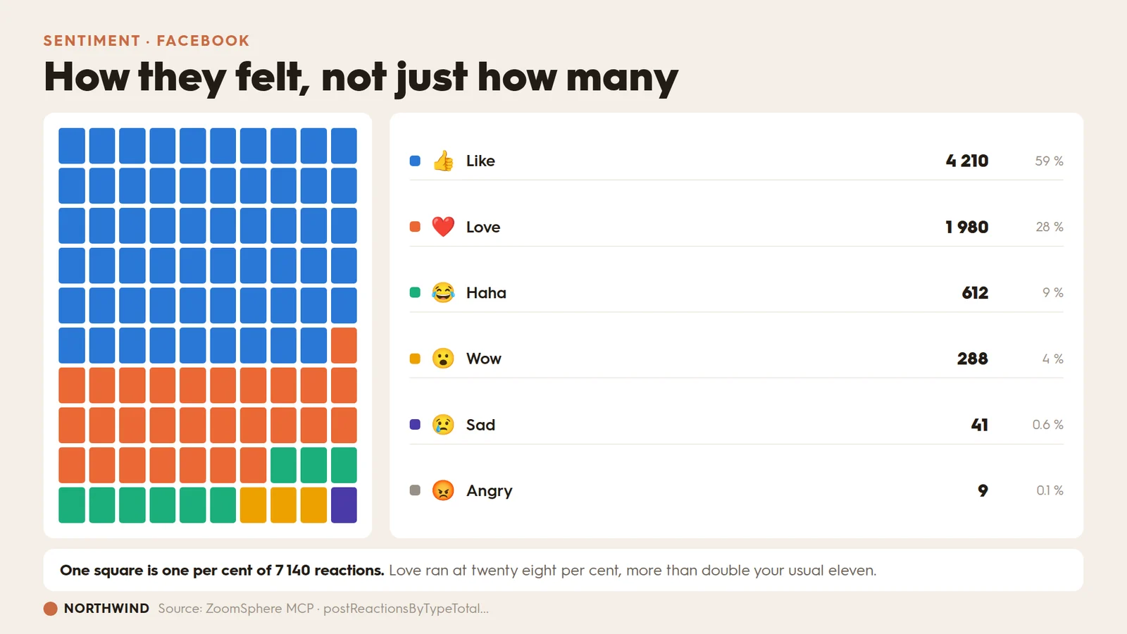
You are already collecting sentiment and throwing it away. Reactions are a free read on tone. A waffle beats a pie here because a client can count the squares, and counting is what makes them believe the number.
Prompt 05
Using the ZoomSphere MCP, pull the Facebook reaction mix for 1-30 September 2026: postReactionsByTypeTotalLike, Love, Haha, Wow, Sorry and Anger. Pull the same mix across the previous six months so you can say what my usual Love share is.Build one slide:- A waffle of exactly one hundred squares, ten by ten, filled row by row from the top left. One square is one per cent of all reactions. Round to whole squares and give any leftover squares to the largest reaction.- One colour per reaction, taken from the deck palette in descending order of size.- On the right, a list: colour swatch, the emoji for that reaction, the name, the absolute count with a space as the thousands separator, and the share as a percentage.- Title it as a question about how people felt, not how many reacted.- One sentence under it stating what one square represents, and comparing this month's Love share to my usual.Do not use a pie chart for this. The waffle is the point: the client can count it.
06. Story drop-off: which frame lost them
The form: funnel with the creative attached.
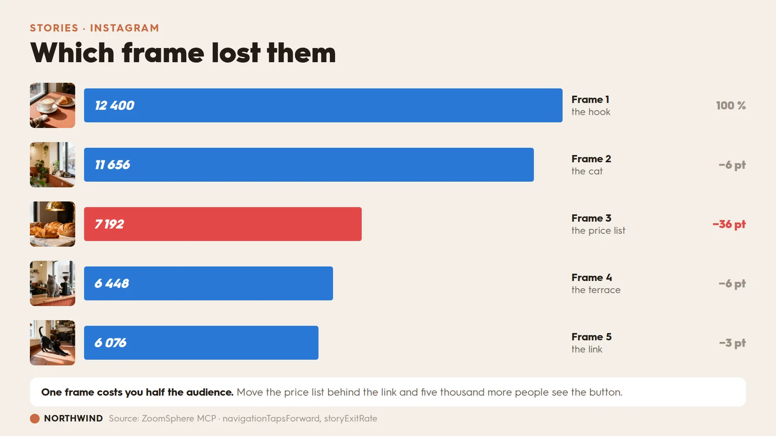
Story analytics usually arrive as a single completion rate, which tells you nothing you can act on. Break it into frames, hang the actual creative next to each bar, and the fix names itself in the meeting.
Prompt 06
Using the ZoomSphere MCP, pull frame by frame retention for my Instagram stories published in September 2026: navigationTapsForward, navigationTapsExit, storyExitRate and replayRate, together with the creative preview for each frame.Build one slide:- A funnel, one horizontal bar per frame, in order. Bar width is the share of frame one's viewers still watching.- Put the frame's thumbnail immediately to the left of its bar, as a small rounded square.- Print the absolute viewer count inside the bar in white bold.- To the right of each bar: the frame number in bold, a two or three word description of what is on it underneath, and the drop against the previous frame in percentage points on the far right.- Bars are blue except the frame with the biggest single drop, which is red, and its drop figure is red too.- Frame one shows "100 %" instead of a drop.- Title it as the question "which frame lost them".- One sentence under it naming what that frame cost in real people, and the one change to make next month.
07. Volume versus intent: what people wanted to keep
The form: scatter with labelled quadrants.
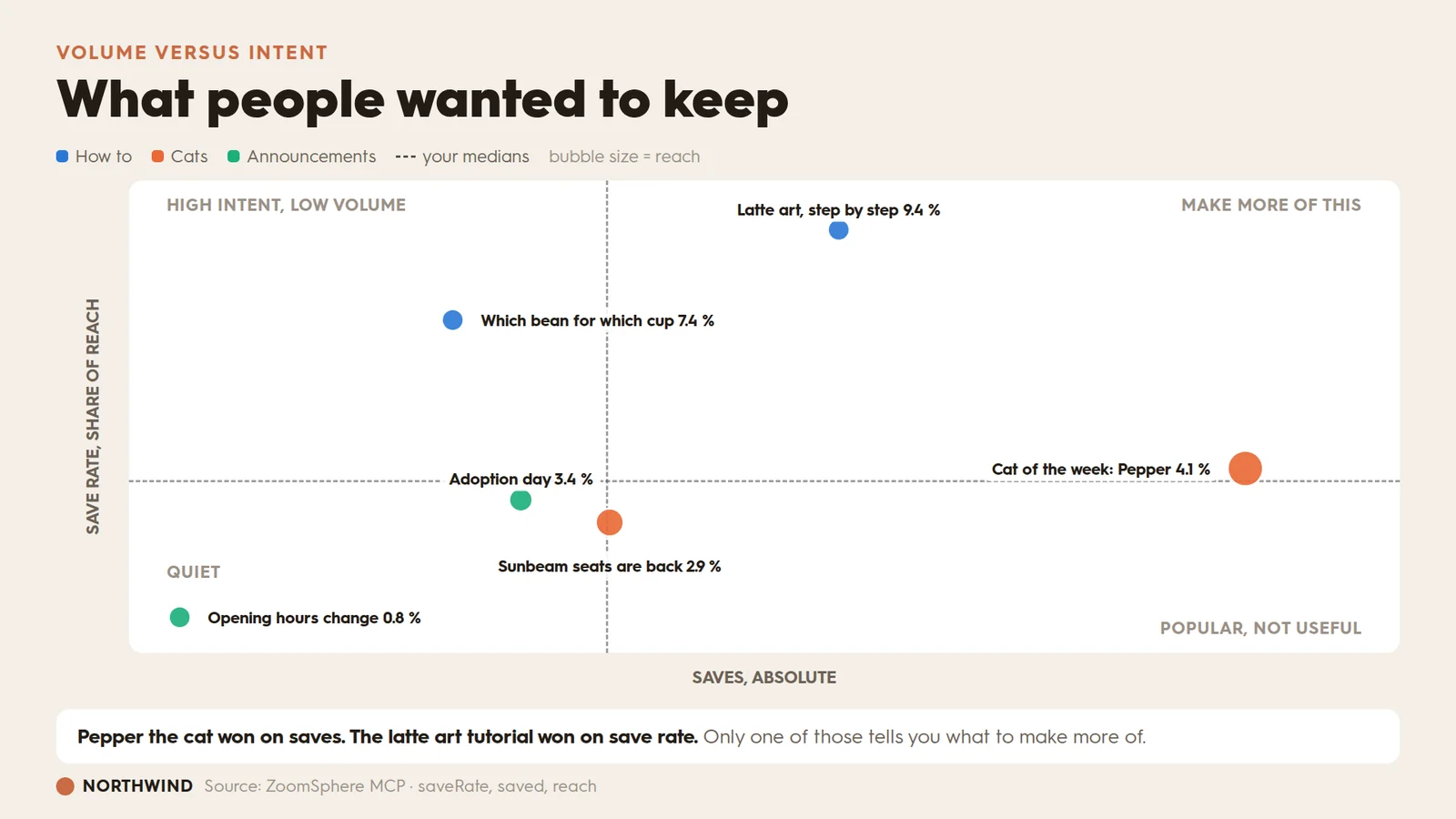
This is the chart nobody builds, and the one that changes what you make. Saves and save rate disagree constantly: the post everyone saw collects the most saves, while the post people actually wanted collects the highest rate. Put them on two axes and the disagreement becomes the finding.
Prompt 07
Using the ZoomSphere MCP, pull every post published between 1 and 30 September 2026 with its saved count, its saveRate and its reach, plus the content pillar each post belongs to from the scheduling context.Build one slide:- A scatter. Saves on the x axis, save rate on the y axis, bubble area proportional to reach.- Colour the bubbles by content pillar. Use at most three pillar colours plus grey for everything else: beyond three, separate dots stop being reliably distinguishable.- Draw a dashed crosshair at my median saves and my median save rate, splitting the plot into four quadrants.- Label the quadrants in small grey capitals: high intent low volume, make more of this, quiet, popular not useful.- Do not label every point. Label the six that matter, each with a short post title and its save rate. Place each label above, below, left or right of its own bubble so that no label overlaps a bubble or another label, and keep every label inside the plot area.- Title it as the question "what people wanted to keep".- One sentence under it contrasting the post that won on volume with the post that won on rate.Rank by save rate, never by raw saves. A post with more reach will always collect more saves, and that tells you nothing.
08. Best time to post: when to post next month
The form: heat map on a single blue ramp.
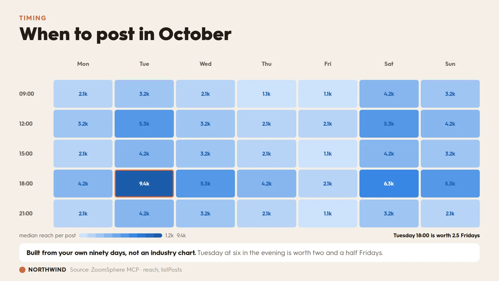
Every best time to post article is someone else's audience. This one is yours, built from what you already published and how it did, which is the only version a client cannot argue with.
Prompt 08
Using the ZoomSphere MCP, list every post I published in the last ninety days with its publish time and its reach, across all connected channels.Build one slide:- A heat map. Seven columns for the days of the week, five rows for the time bands 09:00, 12:00, 15:00, 18:00 and 21:00. The value in a cell is the median reach of the posts published in that slot.- Use one single blue ramp, light for low and dark for high. Never a rainbow, and never red for high, because red means something is wrong everywhere else in this deck.- Print the value in every cell, dark blue on the light cells and white on the dark ones, so it stays readable either way.- Ring the best cell with an orange outline.- Under the chart, a legend strip showing the ramp with the lowest and highest values at its ends, and on the right, in bold, the best slot expressed as a multiple of an average slot.- Title it as the question "when to post in October", using the month after the reporting period.- One sentence under it saying the map is built from my own ninety days rather than an industry benchmark, and naming the best slot.If a slot has fewer than three posts behind it, leave the cell at the palest step and print no value. A median of one post is not a finding.
09. Delivery: what we promised versus what ran
The form: bullet charts against target.
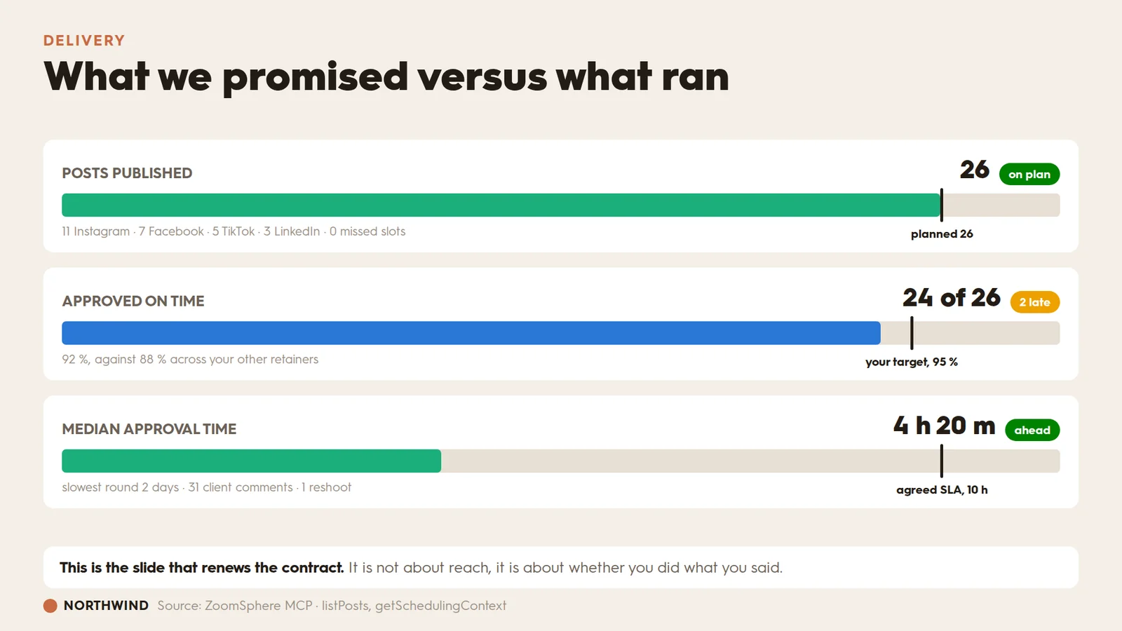
Nine slides of performance and the client still renews on something else: whether you did what you said. Bullet charts put the promise and the delivery on the same track, which is the only honest way to show it.
Prompt 09
Using the ZoomSphere MCP, pull my September 2026 publishing plan and what actually ran: posts planned, posts published, missed slots, posts approved on time, median approval turnaround, slowest approval round, client comments and reshoots. Pull the same approval figures across my other client workspaces so I can benchmark this one.Build one slide with three bullet charts stacked vertically. Each one gets:- A label on the left in small grey capitals, the headline figure on the right in large bold, and a status chip after it: green when I beat the target, amber when I am close, red when I miss it.- A horizontal track with a coloured fill for the actual value and a thick dark vertical marker for the target, with the target named in small text directly under the marker.- A grey sub line under the track carrying the breakdown.The three charts: posts published against posts planned; approved on time against my 95 % target, with my average across other clients in the sub line; median approval turnaround against the agreed ten hour service level.Scale the fills so the target marker always sits inside the track with room to spare, never jammed against the right edge.- Title it as the question "what we promised versus what ran".- One sentence under it saying this slide is about delivery, not reach.
The master prompt
Once the nine work on their own, chain them. This is the version that goes into a scheduled task on the third of every month, when the last analytics sync has the whole period in it. If you have not set one up before, our guide to automating client reporting with an AI agent covers the scheduling side.
The master prompt
Build the September 2026 report for Northwind, as a PowerPoint deck.PERIOD: 1-30 September 2026, compared against 1-31 August 2026. Where a slide needs a benchmark, use my own history rather than an industry figure: the last six months for medians, the last ninety days for ranges and for timing.CHANNELS: all connected channels. Name any channel that has no data rather than silently dropping it.BRAND: apply the brand block above to every slide, including the fixed chart palette.SLIDES, in this order, each built exactly as specified in the nine prompts above:1. Organic versus paid, as 100 % stacked columns with my organic median as a reference line.2. Followers versus new people, as a butterfly chart with a four step funnel under it.3. Discovery on TikTok, as a donut with month on month deltas beside it.4. Retention per reel, as a line panel over a bar panel with my normal range shaded.5. The Facebook reaction mix, as a hundred square waffle.6. Story drop-off, as a funnel with the creative attached to every frame.7. Saves against save rate, as a scatter with labelled quadrants.8. Best time to post next month, as a heat map on one blue ramp.9. Planned against published, as three bullet charts with targets.THE STORY: every slide title is the question a client would ask. Every slide carries one sentence underneath saying what it means. Where a number moved, name the post behind it rather than describing the movement.WHAT NOT TO DO: no two axis charts, no rainbow ramps, no new palette halfway through, no chart without a benchmark, and no slide that is a chart on its own.Then tell me which three slides you would cut if the client will only read five.
Four rules worth stealing
If you take nothing else from the nine prompts above, take these. They are what separates a report from a pile of charts.
- Name the form, not just the data. "Show me saves" gets a bar chart. "A scatter, saves on x, save rate on y, split at my medians, quadrants labelled" gets the insight. The form is the analysis.
- Always give it a benchmark. Your own median, your ninety day range, the agreed service level, last month. A number with nothing to compare it to is decoration, and the client already knows it.
- Two measures means two panels, never two axes. A dual axis chart can be made to show almost any relationship by sliding one scale. Stack two panels over the same categories and the comparison stays honest.
- One palette, fixed order, across the whole deck. Assign colours in the same sequence on every slide, reserve red for what is wrong and grey for benchmarks. Nothing else makes nine slides look like one deck this cheaply.
The prompts above are written for the ZoomSphere MCP, so the metric names in them are the real ones the connection returns: viewsFromNonAds, saveRate, storyExitRate, averageTimeWatched and the rest. Paste them unchanged against your own workspace and the numbers come back live. Thirty more briefs we use daily live in the public MCP prompt library.
Frequently asked questions
Do I have to write prompts this long every month?
No. You write them once. Month two is one sentence: rebuild the September deck for October, same slides, same brand. The length here is the setup cost, not a monthly tax. A vague prompt gets you a bar chart, and you pay for that in revisions instead.
Does the AI see my client's data?
It sees what the MCP hands it for the workspace you point it at, for the period you name, and nothing else. The connection runs through OAuth under your own login, so there is no export in a downloads folder and no spreadsheet pasted into a chat window.
Which AI does this work with?
Any MCP client. Claude, ChatGPT, Copilot and the rest connect to the same server. The prompts are plain English and carry no model specific syntax.
What happens if a metric is missing for one channel?
Every prompt above says what to do: name the gap rather than drawing a zero. A missing metric and a zero are different facts, and a client who spots one being drawn as the other stops trusting the whole deck.
Can the deck match our existing template?
That is what the brand block is for. Point it at a past client deck and it copies the layout, not only the colours: how you title a slide, which chart you use for reach, where the logo sits.
Why so many rules about colour?
Because a deck where slide four invents its own palette reads as nine separate documents. Fixing the palette, reserving red for problems and reserving grey for benchmarks costs one paragraph and is the difference between a report and a pile of charts.
Can these charts go into PowerPoint, or only a PDF?
Both. The prompts describe the slide, not the file format, so you can ask for a branded .pptx you can still edit, a PDF for sending, or a web page for a client who does not want another attachment.
{{form-component}}








Heading 1
Heading 2
Heading 3
Heading 4
Heading 5
Heading 6
Lorem ipsum dolor sit amet, consectetur adipiscing elit, sed do eiusmod tempor incididunt ut labore et dolore magna aliqua. Ut enim ad minim veniam, quis nostrud exercitation ullamco laboris nisi ut aliquip ex ea commodo consequat. Duis aute irure dolor in reprehenderit in voluptate velit esse cillum dolore eu fugiat nulla pariatur.
Block quote
Ordered list

- Item 1
- Item 2
- Item 3
Unordered list
- Item A
- Item B
- Item C
Bold text
Emphasis
Superscript
Subscript


Recommended for you
.webp)
%20(1).webp)
%20(1).webp)