


You Published 20 Posts. Which Ones Actually Worked?


The short answer
The posts that actually worked are the ones that beat a meaningful comparison group. Not the industry average. Not last year. The posts next to them, for the same client, in the same quarter, on the same platform. Without that side-by-side view, a single post's numbers are unreadable.
Agencies running 5 to 15 clients feel this harder than anyone, because the comparison work multiplies with every account. This article walks through three comparison patterns that turn 20 published posts into decisions your next client call can actually use, and shows why a side-by-side view (like ZoomSphere's Compare Results inside Bulk Actions) replaces the end-of-month spreadsheet rebuild that most agency teams quietly dread.
{{form-component}}
The real problem isn't measurement. It's the comparison gap.
Every social media manager we talk to tracks numbers: reach, impressions, saves, clicks, followers. The native dashboards hand you plenty, and most teams export some version of that into a spreadsheet at the end of the month.
That's not where things break. They break at the next step: turning rows of data into a decision.
A post got 412 impressions on LinkedIn. Is that good? You can't answer the question from the number itself. It's good if it's your highest-performing LinkedIn post that month for that client. It's bad if four of the client's other five posts beat it, and this one ate the most production time. The number alone says nothing. The comparison says everything.
That's the comparison gap. Agency teams measure post by post, client by client, then stare at the rows and feel vaguely productive, because the spreadsheet is full. But nobody stops to ask the one useful question, the one that makes the next client call worth having: compared to what?
The scale is what makes this so painful at an agency. AgencyAnalytics' client-reporting benchmarks report found that 61.8% of agencies pull data from 3 to 5 separate platforms per client, 26.4% pull from 6 to 10, and 2.8% pull from 11 or more. Agencies log into those platforms separately for every client, every reporting cycle. A portfolio of 10 clients means the same login, copy, paste, reconcile loop repeated 10 times, before anyone has made a single decision. And Sprout Social's survey of 500 marketers puts the weekly cost at 3.8 hours per week on data analysis and reporting, roughly 16 hours a month. Most of that time is measurement. Very little of it is comparison.
How to compare social media post performance across platforms
Four steps, in this order:
- Normalize the metric. Don't compare Facebook's native engagement rate to TikTok's. They aren't the same formula. Convert every post to interactions per 1,000 impressions (IPM) as your cross-platform number.
- Pick a meaningful comparison group. Not industry benchmarks. Not last year. Pick a group for this client, on this platform, from the same quarter: top 5 vs. bottom 5, campaign posts vs. evergreen, version A vs. version B.
- Line them up side by side with previews. Post images or thumbnails next to the metrics. Without the preview, you can't see hooks, formats, or visual patterns. Numbers alone won't show it.
- Ask what the winners share that the losers don't. Hook? Format? Day of week? Caption length? Opening line? The answer becomes a content hypothesis for next quarter for that client.
The trap in step 1 is that each platform defines engagement rate differently. According to Socialinsider's 2026 benchmarks methodology, the formulas look like this:
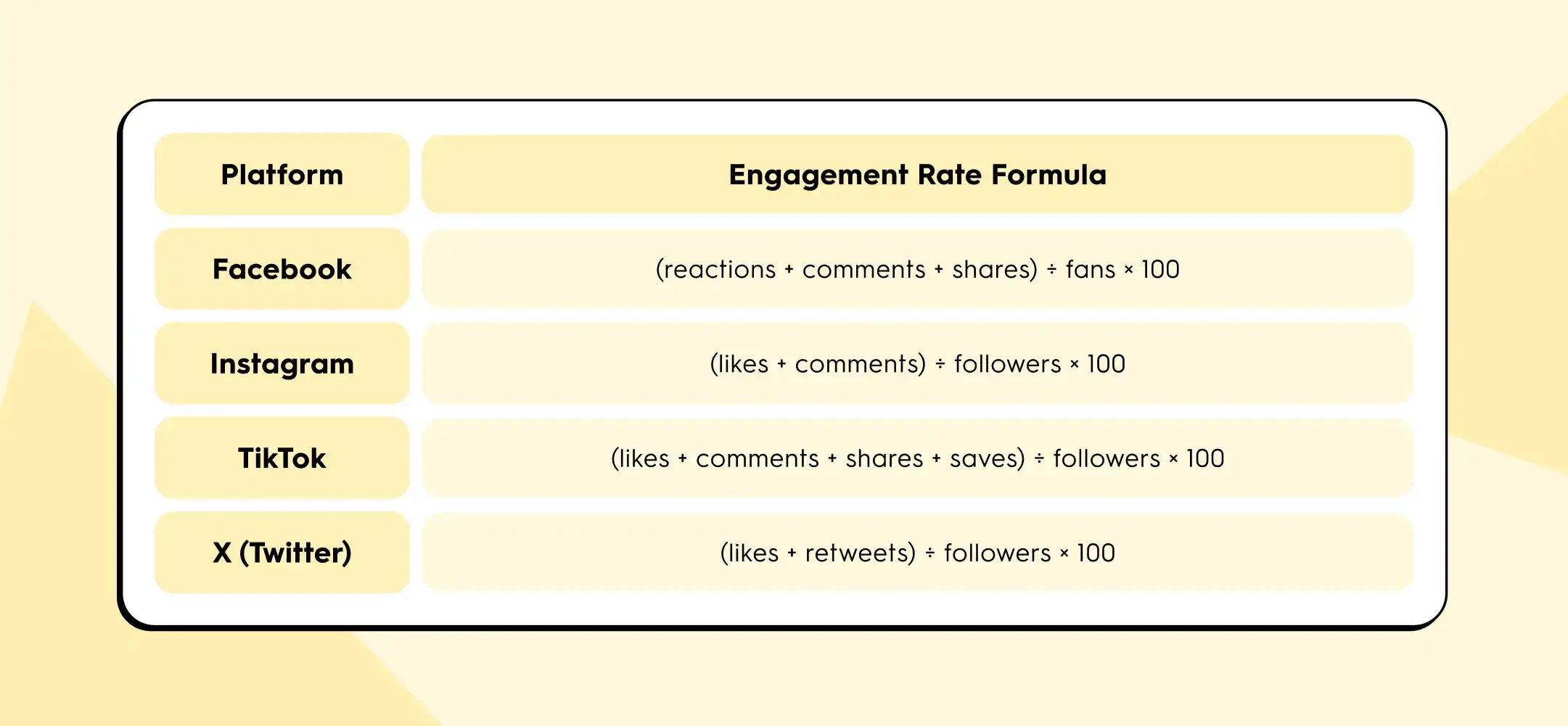
Buffer's State of Social Media Engagement 2026 adds another wrinkle: LinkedIn's engagement rate includes clicks, while most other platforms don't.
If you put all four numbers in the same row of your client report, you are not comparing content performance. You are comparing four different pieces of arithmetic.
IPM solves this because impressions is the one denominator every platform exposes, and interactions (any user action beyond scrolling past) can be counted consistently.
Here's a worked example. One agency client, one campaign post, cross-published to three platforms:
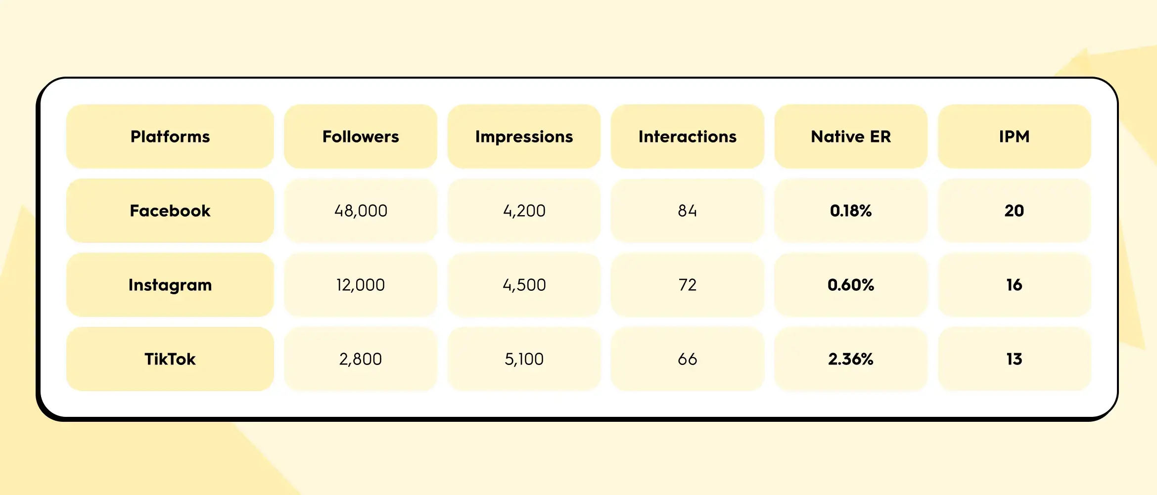
Native engagement rate ranks TikTok first by a mile (2.36% crushes 0.18%). But IPM ranks Facebook first. The disagreement isn't a calculation error. Native ER is inflated on TikTok because the follower denominator is small. Per 1,000 actual eyeballs on the content, Facebook drove the most interactions.
Which one matters depends on the question the client is asking. If the question is "which of our owned channels has the most loyal audience?", native ER on each platform gives you that. If the question is "which channel actually carried this post?", IPM gives you the honest answer. For cross-platform comparisons inside a client report, IPM is the safer metric. For single-platform trend lines over time, native ER is fine. A useful cross-client habit: report IPM as your standard comparison number across every account in the portfolio, then layer platform-native ER underneath for platform-specific conversations.
Three comparisons your monthly report actually needs
Instead of reporting numbers, report differences. These are the three comparison patterns that turn a wall of data into three useful client conversations.
1. Multi-platform post: which channel actually carried the content?
Your team wrote one piece, published it to Instagram, LinkedIn, and Facebook for a client. In most reports, this shows up as three separate rows with three separate sets of numbers, and nobody goes back to check whether the same content performed differently across the three channels.
That's where one of the highest-value insights in monthly reporting quietly hides. Same hook, same copy, same image. Different reach curve, different interaction mix, different click-through behaviour. The story usually isn't "one platform underperformed." The story is which platform is that client's distribution channel, which is their awareness channel, and whether their cross-posting budget is allocated accordingly.
You can't see that without a side-by-side view. And in the native dashboards, a side-by-side view of the same post across three platforms simply doesn't exist.
2. Campaign retrospective: top 5 vs. bottom 5
Pick any campaign from last quarter, from any client in the portfolio. Five posts tied to an event, a product launch, a content series. Line up the five strongest performers next to the five weakest and ask one question: what do the winners have in common that the losers don't?
Usually it comes down to one of four things:
- the hook
- the visual format
- the day of the week
- the length of the caption
You don't need an analytics degree to spot the pattern. You need the posts in front of you, in a row, so your eyes can do what spreadsheets actively prevent them from doing.
This is the fastest way to generate content hypotheses for next quarter across every client you manage. It's also the hardest to do in a standard analytics export, because the preview image is never next to the numbers. Without the preview, you are reconciling post IDs in your head.
3. A/B test: why, not just what
Your team tested two captions for the same visual. One performed better than the other. Fine. The spreadsheet tells you which one won, but it doesn't tell you why.
Seeing the captions next to each other, with the numbers underneath, is where the "why" shows up. Maybe Caption A opened with a question and Caption B opened with a statistic. The visual was identical. The delta is the opening line. You now have a reusable principle for the next 30 posts, across multiple clients in similar categories, not just a winner for this one.
The content preview next to the metrics is the thing that turns a data row into a learning.
From spreadsheet sprawl to side by side
Same task, same client, two workflows. Here's what actually changes, step for step:
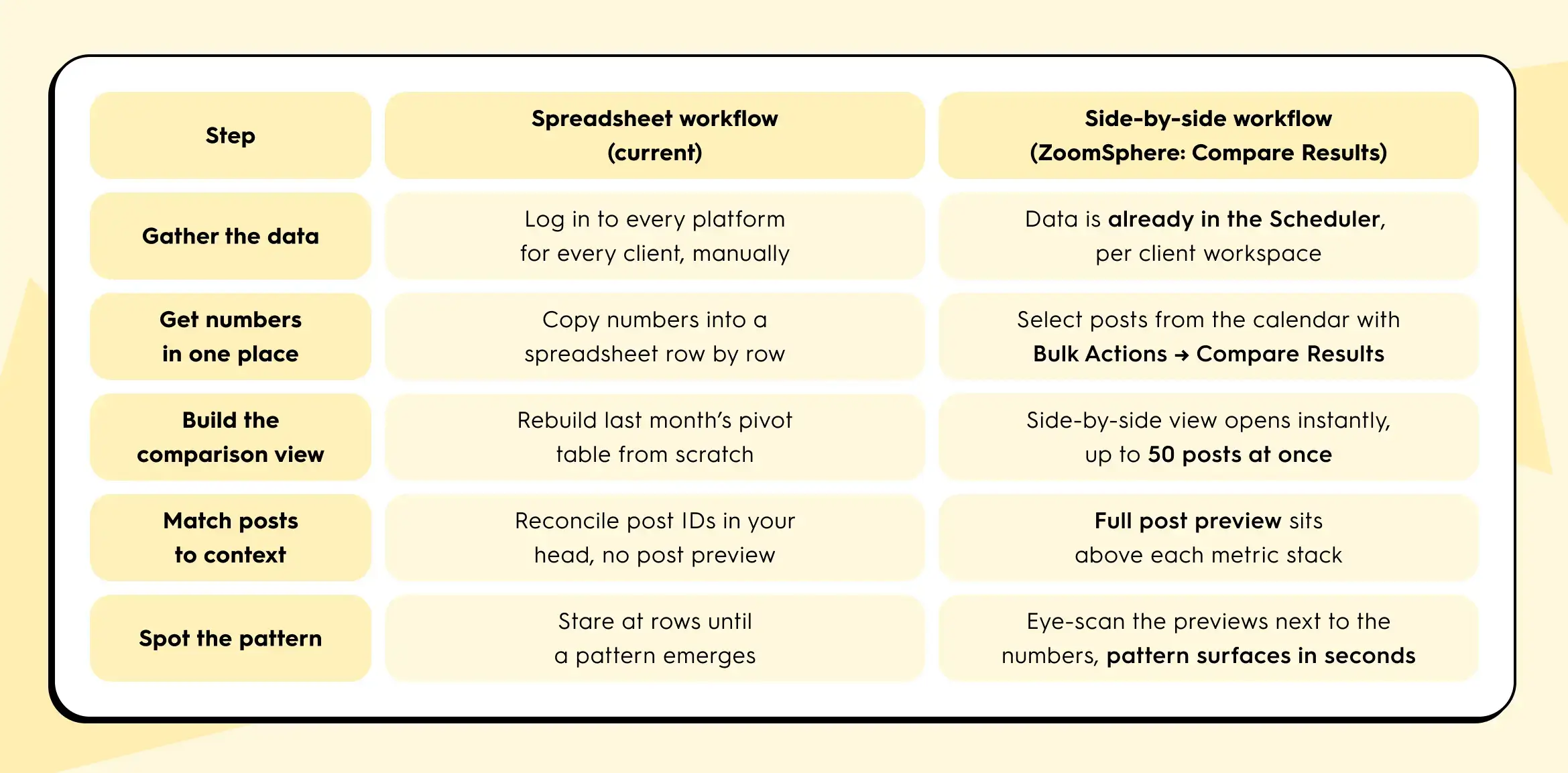
The side-by-side approach collapses the first five rows into roughly one view. You still write the report at the end. But the thinking part and the comparison part now happens in minutes instead of hours, per client.
The 15-minute Q1 review that actually tells you something
It's late April, which means: Q1 closed three weeks ago and Q2 content planning lands on this week's agenda, across every client in your portfolio.
You won't get 60 minutes per client, you'll only get 15. Here's a review that fits that block, scaled across the accounts that matter most first:
- Start with your top three highest-revenue or highest-visibility clients. Open the calendar view of the last 90 days for each, one at a time.
- Select the top 5 and bottom 5 performers by reach for that client. Compare them side by side. Note the pattern.
- Select every post from the biggest campaign that client ran that quarter. Compare them. Note which hooks and formats worked.
- Select every version of the one post that was cross-posted to multiple platforms for that client. Compare them. Note which channels actually pulled their weight.
Three comparisons per client. Fifteen minutes per client. Cycle through the portfolio in priority order until planning week is covered. You walk into each Q2 planning call with three specific, defensible statements about what worked and what didn't for that specific client, grounded in side-by-side evidence. That's the shift from "here are the numbers" to "here's what we're going to do differently for you."
What this looks like in your tool

In ZoomSphere, comparison is built directly into the Scheduler, not bolted on as a separate analytics module. Each client lives in its own workspace, so you move from account to account without rebuilding context. Inside a client's Scheduler, you select posts straight from the calendar using Bulk Actions, then choose Compare Results. The view opens a side-by-side table with each post's preview on top and its metrics (views, reach with organic, viral, and paid breakdowns, interactions, clicks, post saves, and platform-specific counters like Reels Plays and Replays) stacked underneath. You can compare up to 50 real posts at once.
If the same post went to multiple Facebook Pages, channels, or networks, there's a second flow: find the post, click the three-dot menu, choose Compare Results, and you'll see that single post split across all of its sources. It's the fastest way to answer the "is cross-posting actually working for this client, or is one source quietly carrying the whole thing?" question.
No export step. No pivot table. No holding the previous number in your head while you open another native dashboard in another tab.
If your current tool doesn't let you line up 5 posts, 20 posts, or a full campaign's worth of posts next to each other in under a minute, per client, that's the gap between "we measure" and "we learn from measurement." It's the same gap Sprout Social's 3.8-hours-per-week finding points at: a lot of hours spent pulling numbers, a lot fewer spent on the thinking those numbers are supposed to enable.
One thing to try this week
Before Q2 planning locks in, pick one client in your portfolio. Pull up their last 20 published posts. Pick five. Put them side by side. Ask: what do the top two have in common that the bottom three don't?
That's the question that turns a spreadsheet into a strategy. Whether you do it in ZoomSphere or anywhere else, do it once for one client this week. You'll see why we keep talking about it.
If you want to try it inside ZoomSphere, it's already sitting in your Scheduler under Bulk Actions → Compare Results.
{{cta-component}}
Quick answers for cross-platform comparison
A few questions we get from agency managers every time this topic comes up.
What is IPM (interactions per 1,000 impressions)?
IPM is a normalized engagement metric calculated as (interactions ÷ impressions) × 1,000. It expresses how many user actions a post earned per 1,000 eyeballs on the content. Because impressions is the one denominator every major platform exposes, IPM lets you compare Facebook, Instagram, TikTok, LinkedIn, and X posts directly without the definition mismatch that breaks native engagement rate.
Why is engagement rate different on each platform?
Each platform defines engagement rate with its own formula. Facebook uses fans as the denominator and counts reactions, comments, and shares. Instagram uses followers and counts only likes and comments. TikTok adds saves. LinkedIn includes clicks. When you put these side by side in a client report, you are not comparing content performance, you are comparing four different pieces of arithmetic. For an apples-to-apples view across platforms, use IPM.
How do I compare Instagram and TikTok performance for the same client?
For a single cross-posted piece of content, calculate IPM for each platform: (interactions ÷ impressions) × 1,000. Then put the two posts side by side with their previews above the metrics. TikTok will usually win on native engagement rate because its follower denominator is smaller. IPM gives you the honest per-thousand-impressions comparison. Add reach, saves, and (where relevant) shares underneath to read the full story, not just the headline number.
How many posts should I compare at once?
For pattern-spotting, 5 vs. 5 is the sweet spot for top vs. bottom performers. For campaign retrospectives, compare every post in the campaign (usually 8 to 15). For cross-platform reviews of a single piece, compare every destination (2 to 4 platforms). ZoomSphere's Compare Results view handles up to 50 real posts side by side, which covers a full quarter's worth of a campaign for one client without splitting the view.
What's the fastest way to spot a top-performing post pattern?
Line up the top 5 and bottom 5 posts from the last 90 days for one client, with previews next to the metrics. Ask what the winners share that the losers don't. The answer is almost always one of four things: the hook, the visual format, the day of the week, or the caption length. You don't need an analytics degree, you need the posts in a row so your eyes can do the work a spreadsheet prevents.


Heading 1
Heading 2
Heading 3
Heading 4
Heading 5
Heading 6
Lorem ipsum dolor sit amet, consectetur adipiscing elit, sed do eiusmod tempor incididunt ut labore et dolore magna aliqua. Ut enim ad minim veniam, quis nostrud exercitation ullamco laboris nisi ut aliquip ex ea commodo consequat. Duis aute irure dolor in reprehenderit in voluptate velit esse cillum dolore eu fugiat nulla pariatur.
Block quote
Ordered list

- Item 1
- Item 2
- Item 3
Unordered list
- Item A
- Item B
- Item C
Bold text
Emphasis
Superscript
Subscript


Recommended for you
.webp)
.webp)
%20(1).webp)

